Logo Design
About This Project
Designing a logo for an animation business.
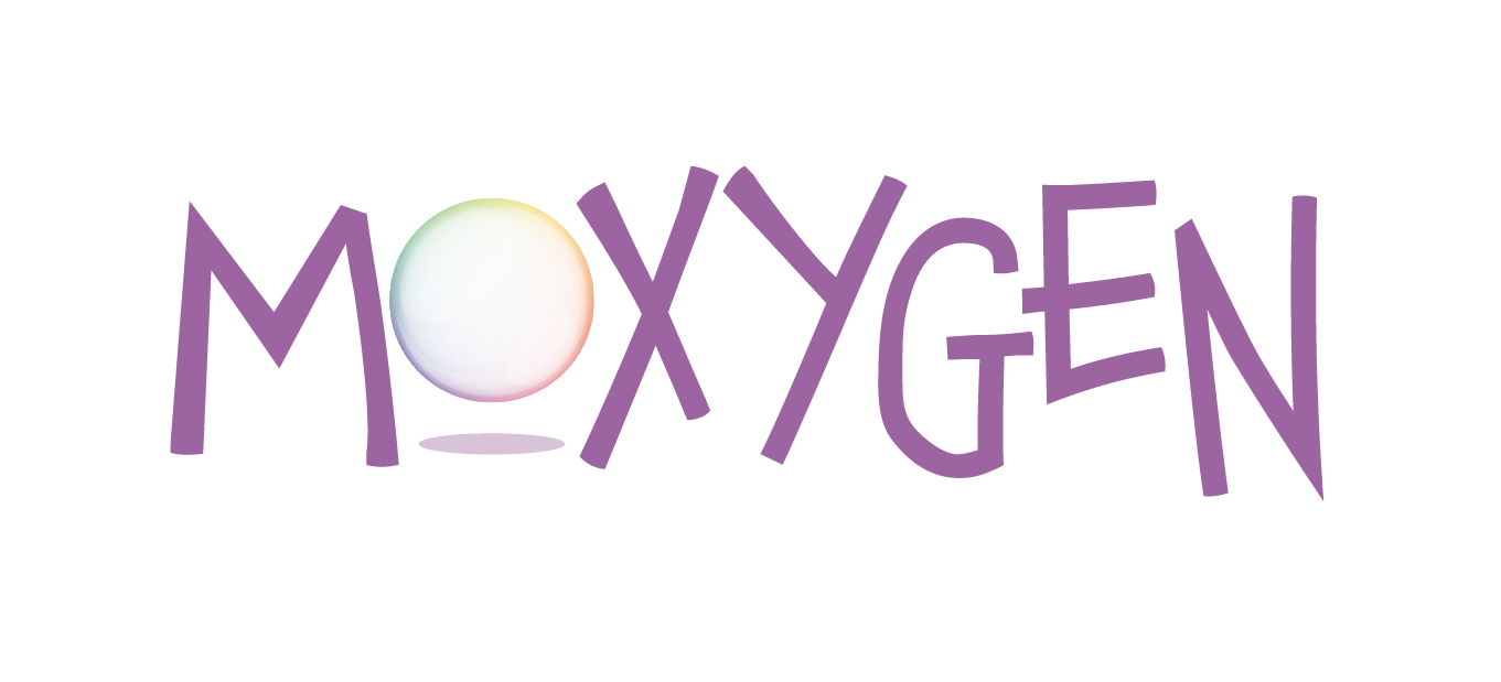
We were tasked by a talented animator to come up with a logo design which would reflect the fun, energetic and fluid nature of her animation style. The design would also have to work once animated too.
With the business name of "Moxygen" already settled on, we got to work crafting this playful logo which reflects the fluidity and whimsey of both Moxy's personality and creative style.
With the soft lavender tone and playful font of the logotype juxtaposed with the delicate form of the bubble, this logo creates a strikingly unique image, which can be used to tell Moxy's stories in imaginative and wonderful ways.
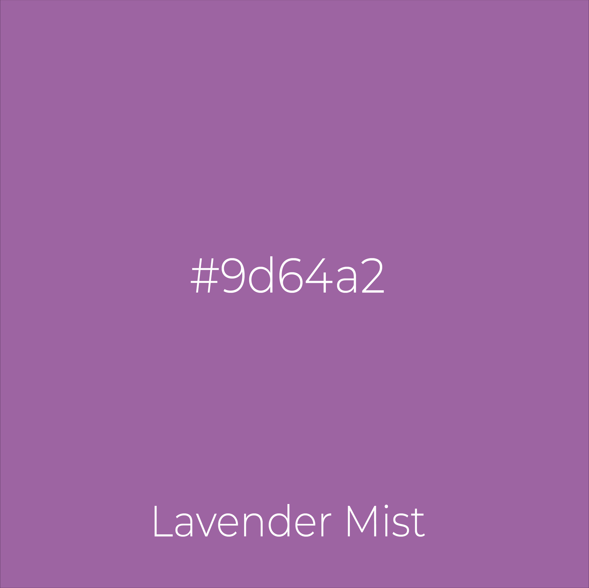
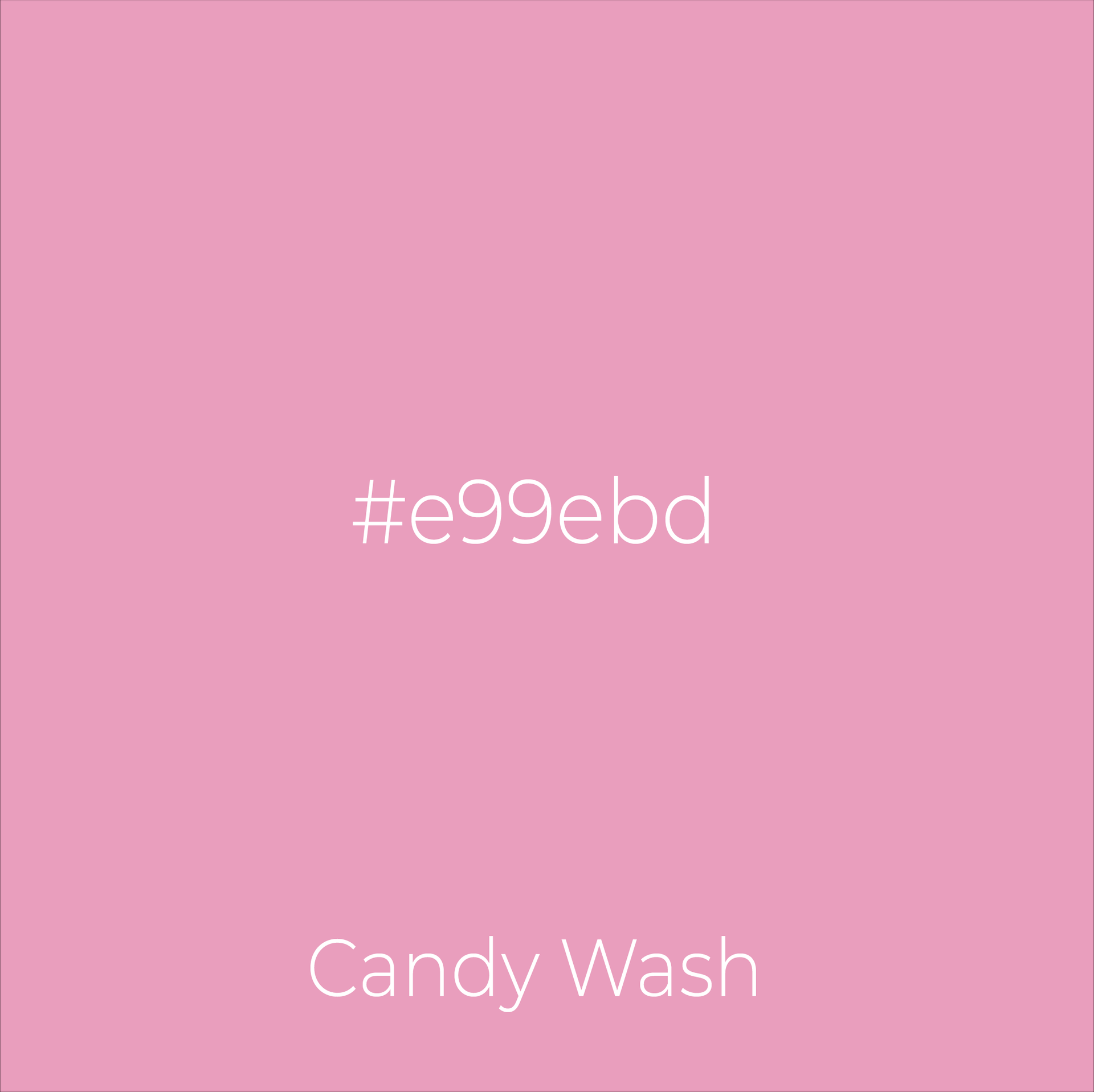
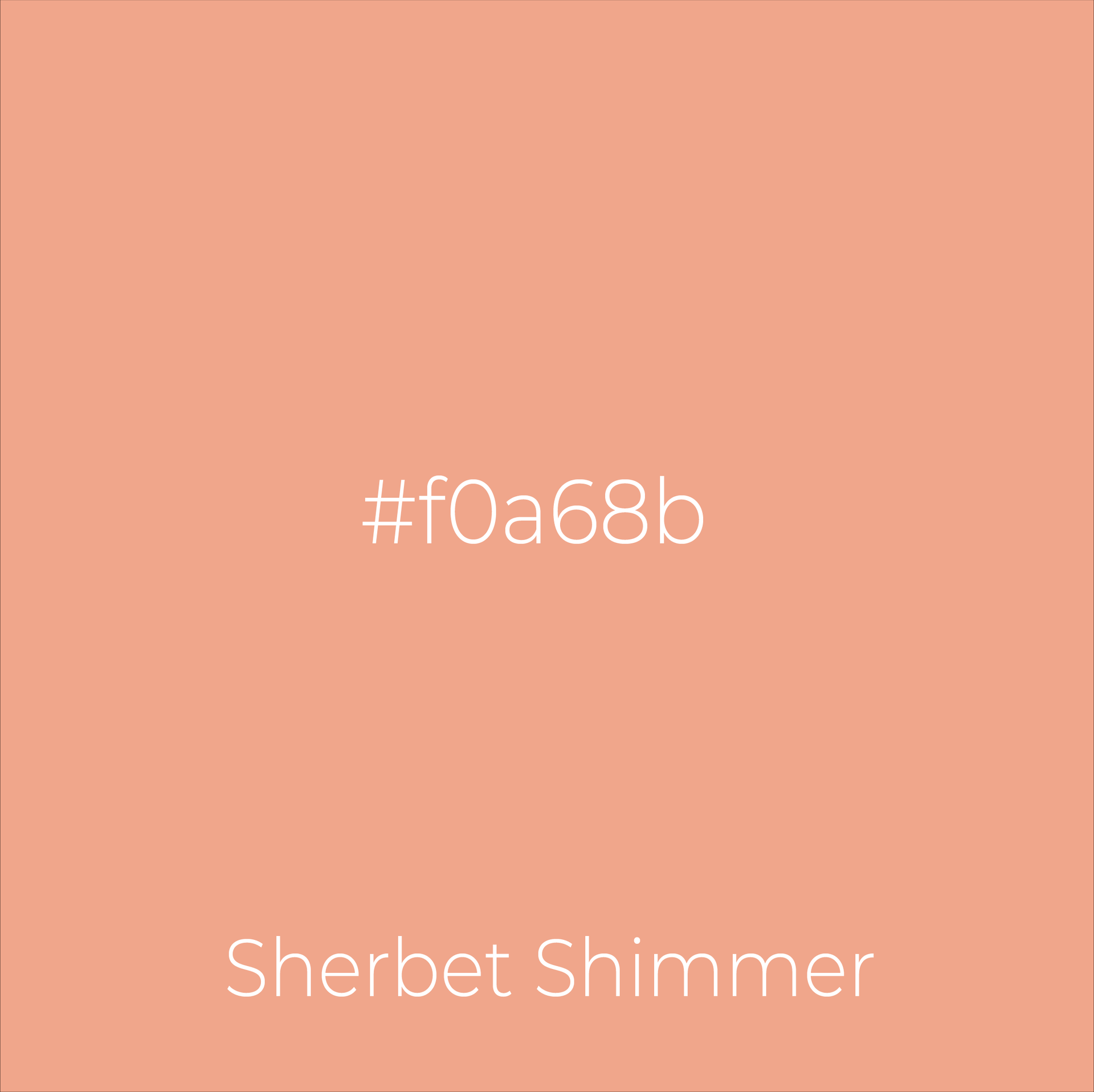
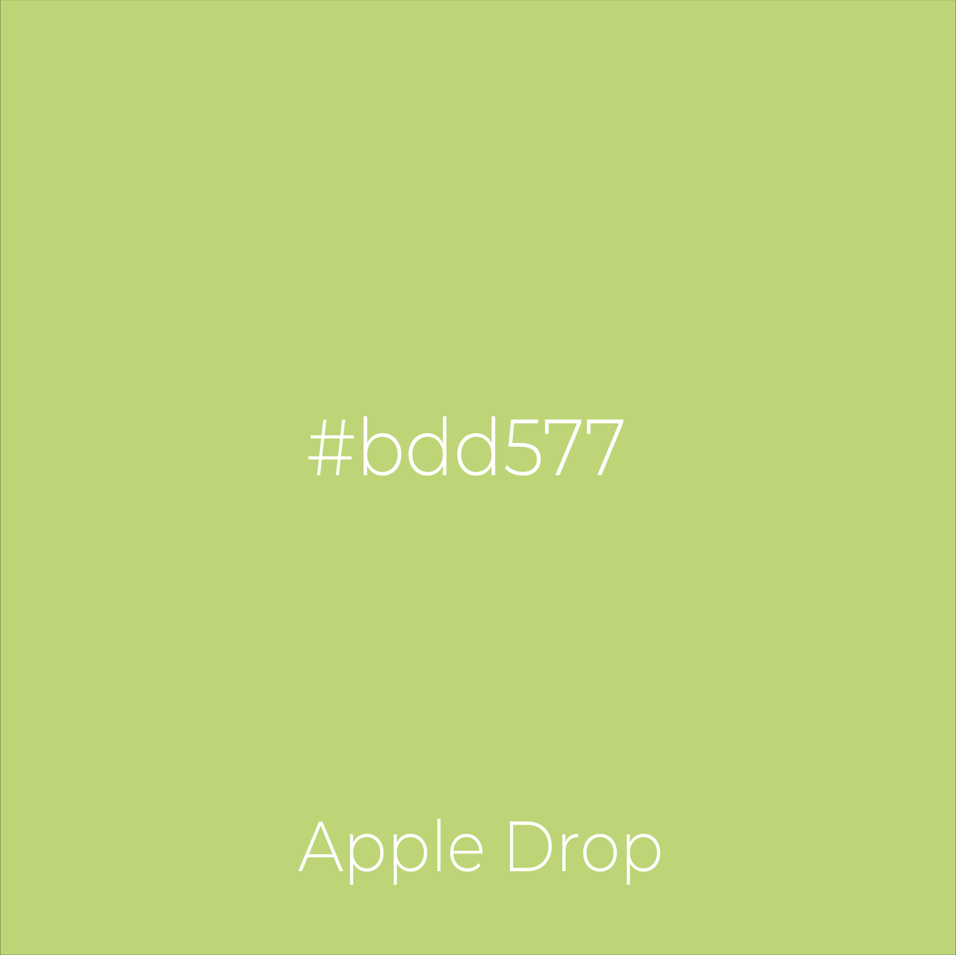
Colour palette
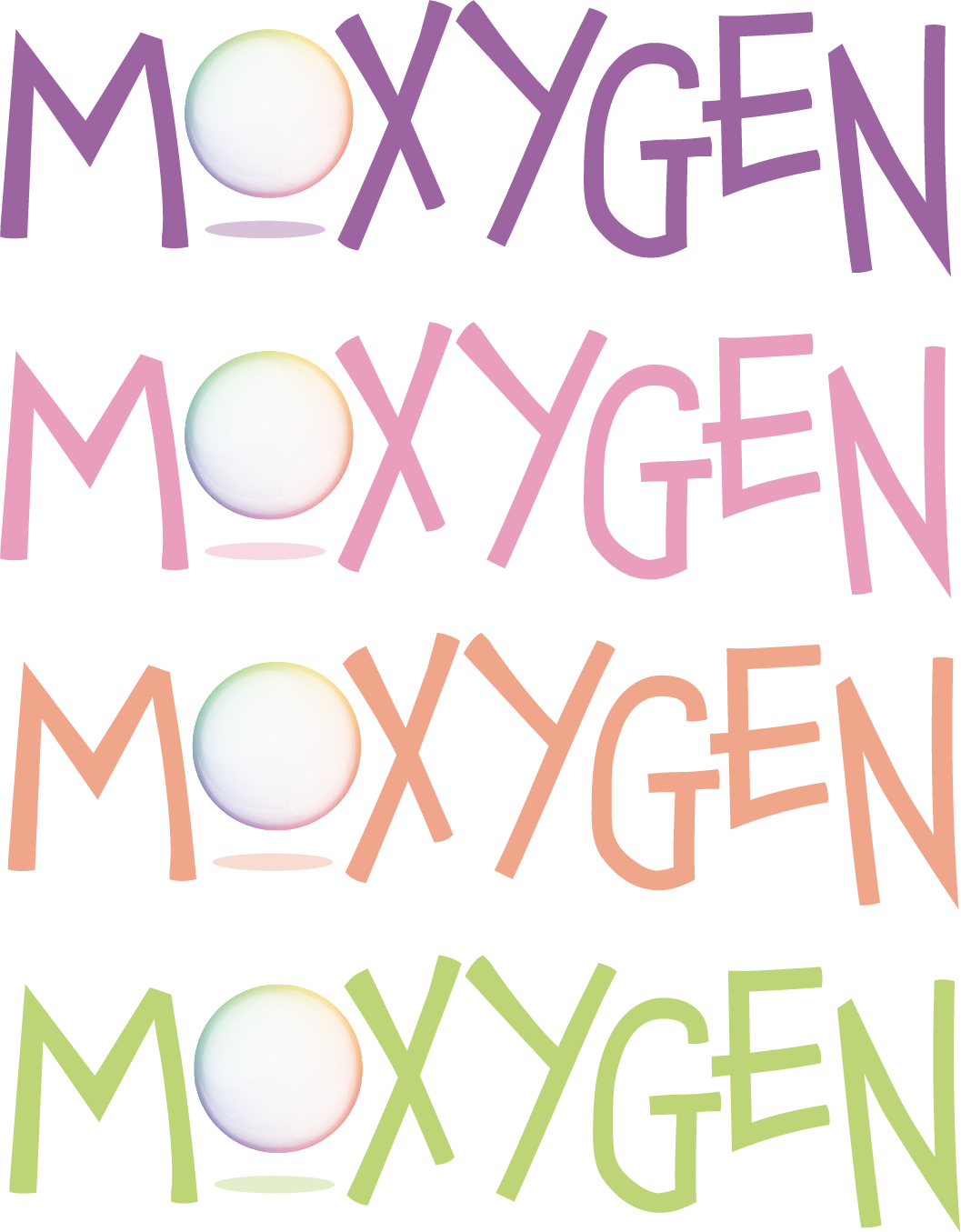
The colour palette is based on the dancing light refraction of a bubble, again playing on the fluidity theme, as well as highlighting the movement and reflective nature of both a bubble and Moxy's work. By using these vibrant colours, it provides a lot of variation in how the logo is used.
